 CSS Battle Top Solutions
Daily target ·
One shadow list, two jobs: a notched column in 157 characters
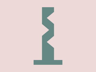
#eed9d9#668884<style>*{background:#EED9D9;color:668884;margin:270 140-260;box-shadow:0-5vw,0-291q 0-37q,0 89q,88q 97q;*{margin:-216 8 460 64;color:EED9D9;rotate:6-1 7 1radThe November 3 target is a grey-green column standing on a wider base, with three triangular notches: two on the right, one on the left. Vegy’s solution has no gradient and no clipping. It writes one list of four shadows, and both html and body use it: on html they draw the column, on a 3D-rotated body they carve the notches.
Use Wide view to see what happens off the canvas, and turn off Teaching colors to see the real colors.
120 × 290
48 × 46
1. html drops below the base
margin:270 140-260. In quirks mode, the height of html is 300 − 270 + 260 = 290: its box (120 × 290) starts just under the base and runs off the canvas. Its background goes to the canvas, so the box itself is invisible. Its 4 shadows are still hidden underneath: an outer shadow is never painted under its own box.
2. 0-5vw: the base
The shadow moves up 20px (5vw). Only the strip that sticks out above the box shows: that is the 120 × 20 base.
3. 0-291q 0-37q: the column
A spread of −37q (−35px) shrinks the shadow to 50 × 220. It moves up 291q (275px) and comes out above the box, right on top of the base: that is the column.
4. 0 89q and 88q 97q: parked under the box
These two shadows move down. Whatever sticks out of the box lands outside the canvas: on html they do nothing. They are there for the body.
5. The body, in the background color
The body gets the same rules through *: same background, same shadows. margin:-216 8 460 64 makes it a 48 × 46 box at (204, 54), and color:EED9D9 turns its shadows into the background color. Shown in coral here so you can see it.
6. rotate:6-1 7 1rad
A 1 rad (57°) rotation around the 3D axis (6, −1, 7), through the center of the box. With no perspective, it is flattened on screen: the rectangle becomes a parallelogram with slanted edges. The part lying on the column carves the top notch.
7. The same shadows, in the rotated frame
The shadow offsets follow the rotation of the body. 0-5vw lands next to the column, on the background; 0-291q 0-37q vanishes (a −35px spread on 48 × 46); 0 89q carves the left notch, and 88q 97q the bottom right one.
8. Result: 157 characters
In the real colors, the parallelograms blend into the background: only the three notches remain. Four shadows draw everything, and the ones that are not needed hide under the html box or vanish.
The code, spaced out
* {                              /* html, then body */
  background: #EED9D9;
  color: 668884;                 /* shadows use this color */
  margin: 270 140 -260;
  box-shadow: 0 -5vw, 0 -291q 0 -37q, 0 89q, 88q 97q;
  * {                            /* body (head and style stay hidden) */
    margin: -216 8 460 64;
    color: EED9D9;               /* same shadows, background color */
    rotate: 6 -1 7 1rad;
  }
}
How it works
1. html is an invisible frame under the base
margin:270 140-260 places html at x 140, y 270, 120px wide. CSS Battle runs in quirks mode, where html fills the page height minus its margins: 300 − 270 + 260 = 290px. Its box runs from just under the base to far below the canvas.
The box itself never shows: the background of html is painted on the whole canvas. And an outer shadow is never painted under its own box, so the shadows only show where they stick out of it.
2. Two shadows draw the column
0 -5vwmoves a copy of the box 20px up. Only the strip above the box shows: the 120×20 base.0 -291q 0 -37qshrinks the copy by 35px on each side (spread −37q), to 50×220, and moves it 275px up. It comes out right on top of the base: the column.0 89qand88q 97qmove down. What sticks out of the box lands below the canvas, so onhtmlthey do nothing.
The shadows have no color of their own, so they take color: 668884. In quirks mode, a color can drop its #.
3. body gets the same shadows, in the background color
* also matches body, so it gets the same background and the same four shadows. Its own rule changes two things:
margin:-216 8 460 64makes it a 48×46 box at (204, 54), on the top right of the column;color:EED9D9turns all its shadows into the background color.
So everything the body draws erases the column.
4. A 3D rotation that ends up flat
rotate:6-1 7 1rad turns the body by 1 radian (57°) around the 3D axis (6, −1, 7). There is no perspective, so the result is flattened on the screen: the rectangle becomes a parallelogram with slanted edges. Its shadows turn with it, so their offsets now point in rotated directions.
Without the rotation, the notches would be plain rectangles. The slanted edges come from the 3D turn alone.
5. Who does what
| Shadow | On html |
On the rotated body |
|---|---|---|
| (the box itself) | invisible | top notch |
0 -5vw |
the base | lands next to the column, on the background |
0 -291q 0 -37q |
the column | vanishes: −35px of spread on a 48×46 box |
0 89q |
below the canvas | left notch |
88q 97q |
below the canvas | bottom right notch |
Golf notes
- One shadow list serves two elements:
*hands it tohtmlandbody, and onlycolorchanges. color:668884andcolor:EED9D9: no#needed in quirks mode.5vwis 20px in 4 characters;q(a quarter of a millimetre) gives fine offsets like291q.6-1 7 1radneeds no space before the minus sign.<style>is never closed.