 CSS Battle Top Solutions
Daily target ·
One tile, slid halfway: a lollipop in 153 characters
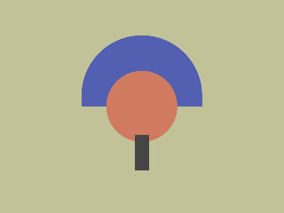
#9959#535fb1#d07b5f#444 <style>&{background:radial-gradient(1Q,#d07b5f 53Q,#0000),radial-gradient(1in at 50%95%,#535fb1 90Q,#9959 89%)0 50vh;*{margin:190 190 60;background:#444The October 8 target looks like a lollipop, or a little tree: a blue half-disc standing on its flat side, an orange disc in front of it, and a grey stick underneath. Vegy draws it with two gradients on html and the body as the stick. The clever part is how the half-disc gets its flat side: nothing cuts it, the background tile does.
✓ 100% match
1/6. & is html. Its background has two layers, and the last one is painted first: a 1in circle at 50% 95%, blue up to 90Q (85px), then #9959, an olive at 60% opacity.
2/6. Behind everything, the canvas is white. A 60% olive over white gives the target's beige: #9959 takes 5 characters, the opaque #c2c299 would take 7.
3/6. 0 50vh slides the layer 150px down. Backgrounds repeat by default, so a copy comes in from above, and its bottom edge cuts the circle flat at y=150.
4/6. The first layer goes on top: an orange disc of 53Q (50px) in the middle. #0000 has no position, so it snaps to 53Q and the edge stays sharp.
5/6. * inside & matches html's children. head and style stay hidden; body takes margin:190 190 60 and, stretched to the page height, ends up 20×50: the grey stick.
6/6. Two gradients and one box: the whole picture in 153 characters.
The code, spaced out
& {                            /* & alone is html */
  background:
    radial-gradient(1Q, #d07b5f 53Q, #0000),                     /* layer 1, on top */
    radial-gradient(1in at 50% 95%, #535fb1 90Q, #9959 89%)      /* layer 2, below */
      0 50vh;                                                    /* its position */
  * {                          /* html's children: head, style, body */
    margin: 190 190 60;
    background: #444;
  }
}
How it works
1. Two layers on html
At the top level of a style sheet, & means the root: html. Its background lists two layers. The first one is painted on top, the last one at the bottom, so the picture is built from the second gradient up.
2. A see-through color for the background
The bottom layer is a circle with a 1in (96px) radius, centered at 50% 95%, so near the bottom edge. It is blue up to 90Q (85px), then #9959 all the way out.
#9959 is a 4-digit hex color with alpha: #999955 at 99, which is 60% opacity. The canvas behind the page is white, and 60% of that olive over white gives the beige of the target, about #c2c299. The see-through version costs 5 characters, the opaque one 7.
3. The flat side comes from the tile edge
0 50vh moves the layer down by half the height, 150px. A background repeats by default, so the gap at the top is filled by a copy of the same tile, coming from above.
That copy’s circle is now centered at y = 285 − 300 + 150 = 135, and the copy stops at y = 150, where the next tile begins. Everything below that line belongs to the next tile, whose circle is far below the frame. So the circle is cut by a perfectly straight line: the flat side of the half-disc. No clipping, no extra element.
4. The orange disc on top
The first layer is radial-gradient(1Q, #d07b5f 53Q, #0000), in the middle of the page:
1Qmakes it a circle (a single length is a radius). The radius itself does not matter, because the stop is an absolute length.- Orange up to 53Q, about 50px.
#0000(transparent) has no position. A stop can’t come before the previous one, so it snaps to 53Q and gives a sharp edge.
5. body is the stick
* nested in & matches every child of html. head and style stay hidden, so only body shows. With margin:190 190 60 (no units needed in quirks mode, which CSS Battle uses):
- it starts 190px from the top and 190px from each side, so it is 20px wide;
- in quirks mode,
bodystretches to fill the page height, minus its margins: 300 − 190 − 60 = 50px.
That gives the 20×50 grey stick at (190, 190), painted over the orange disc.
Golf notes
#9959replaces an opaque 7-character color by letting the white canvas finish the job.0 50vhwith the defaultrepeatturns a full circle into a half-disc, for 6 characters.&alone selectshtmland saves thehtmlkeyword.- The leading space before
<style>does nothing: the browser drops it.
If you try it at home
CSS Battle scores solutions in its own, older Chrome. In the latest Chrome (version 156 when this was written), this page comes out 430px tall instead of 300px, so the circles move down and the match breaks. On the CSS Battle judge, it is a 100% match.